JP Morgan Private Bank: Onboarding
Planning and estimation
Generative research: user interviews
Competitor review
AI vibe coding
Strategy/Architecture
Service Design
Interaction design
Evaluative research: user testing
Developer handoff and accessibility
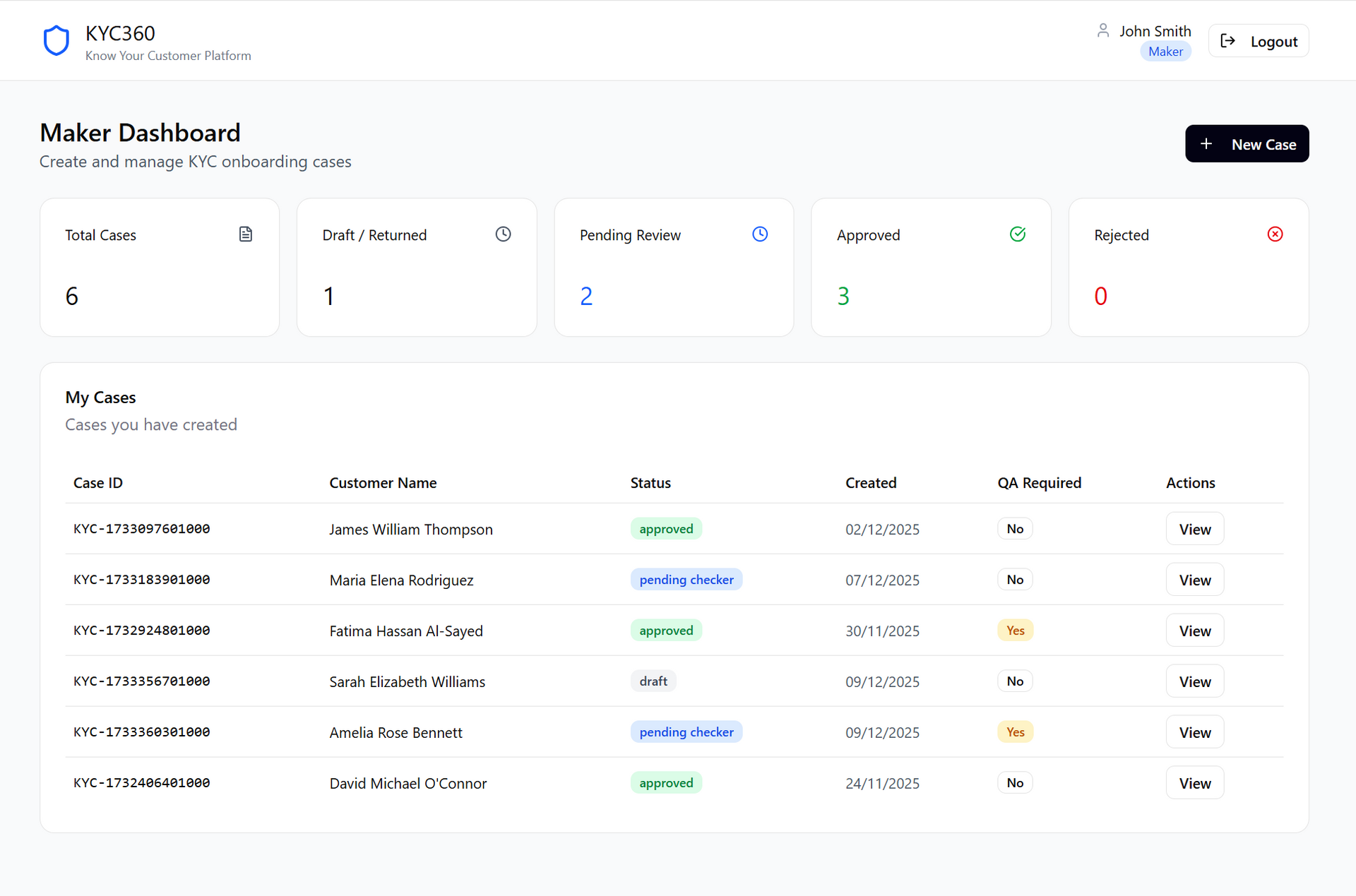
An international onboarding and KYC redesign that reduced onboarding from 30 days to 4.
I unified fragmented systems, embedded AI patterns, and reduced operational risk while navigating cross-programme coordination.
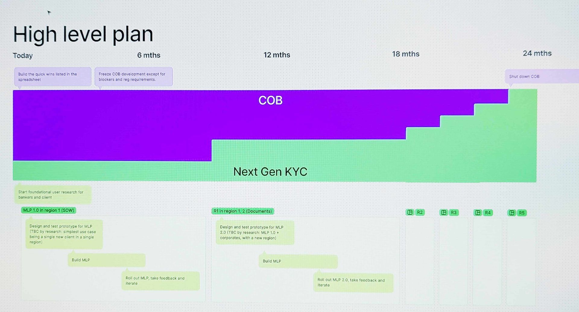
Planning and estimation
The Product Owner needed a plan to roll out the new app. Although it was intended as a multi-year project, leadership wanted visible impact within a few months.
I drew up this plan to analyse the existing functionality, cross-reference it with the preliminary designs, and identify features we could release early without disrupting existing user journeys or data structures.
This incremental approach would demonstrate progress quickly while reducing risk by delivering working code as soon as possible.
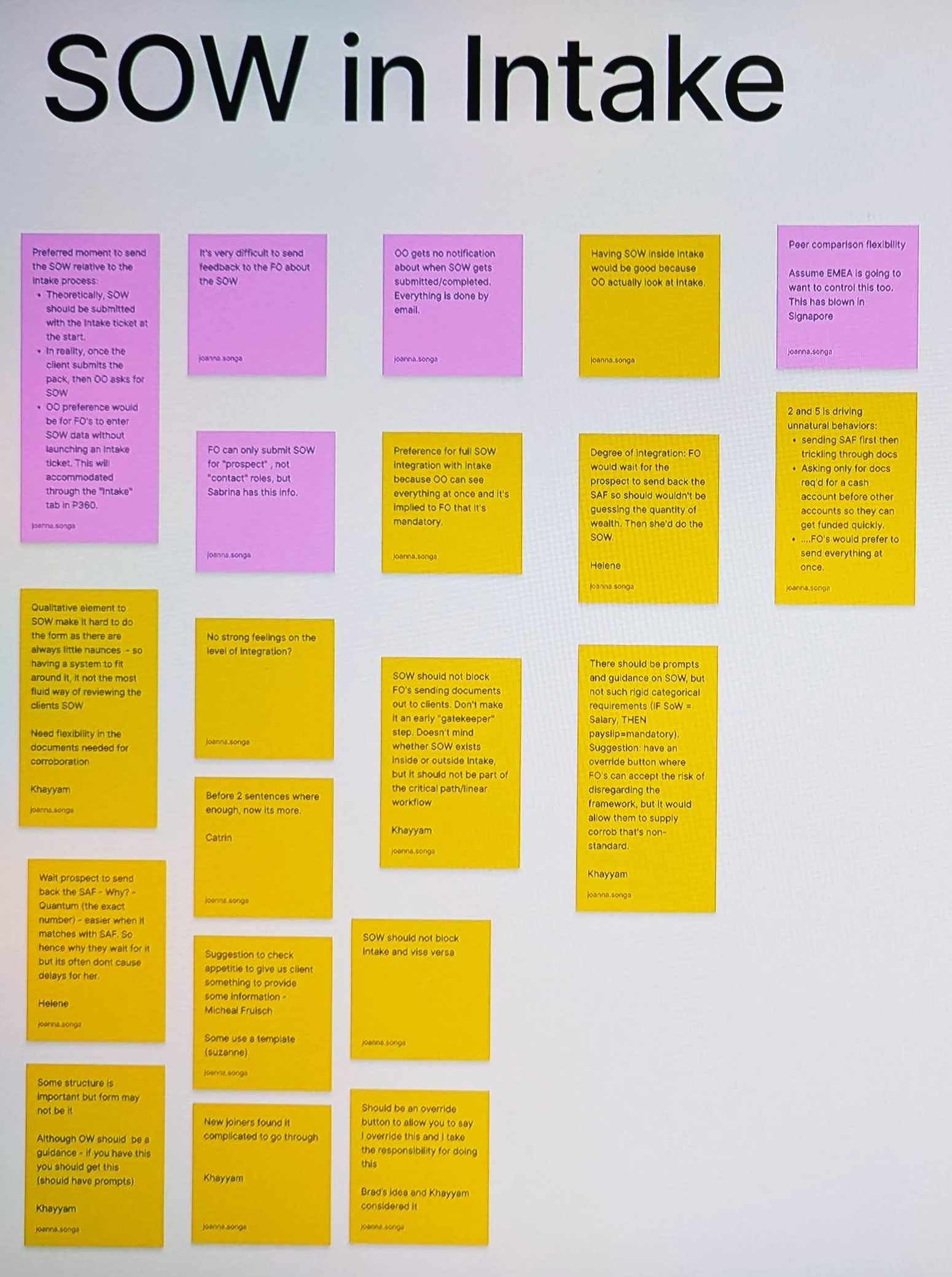
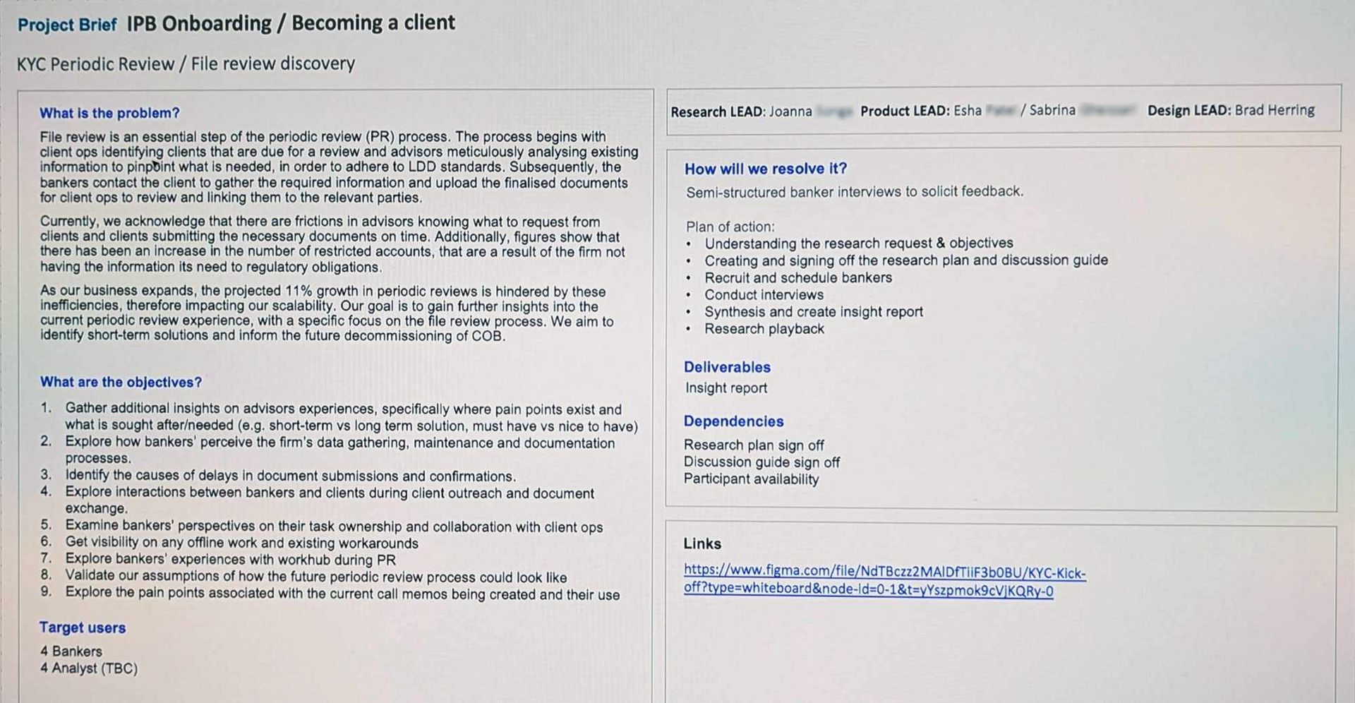
Generative research
We had access to a pool of bankers and operations staff who had volunteered to help with the redesign. We acknowledged that not using random sampling would skew our findings, and proceeded because it allowed us to iterate rapidly.
In collaboration with researchers, I developed research plans, and conducted interviews and panel discussions to validate assumptions and challenge our brief.
I was at odds with the researchers about using panels due to the HiPPO effect, but ultimately the panels:
- increased the volume of data
- increased buy-in and decreased the risk of rejection by involving more Advisors
Later we would create an affinity map/clusters and used the needs and motivations we discovered to prioritise design features.
test
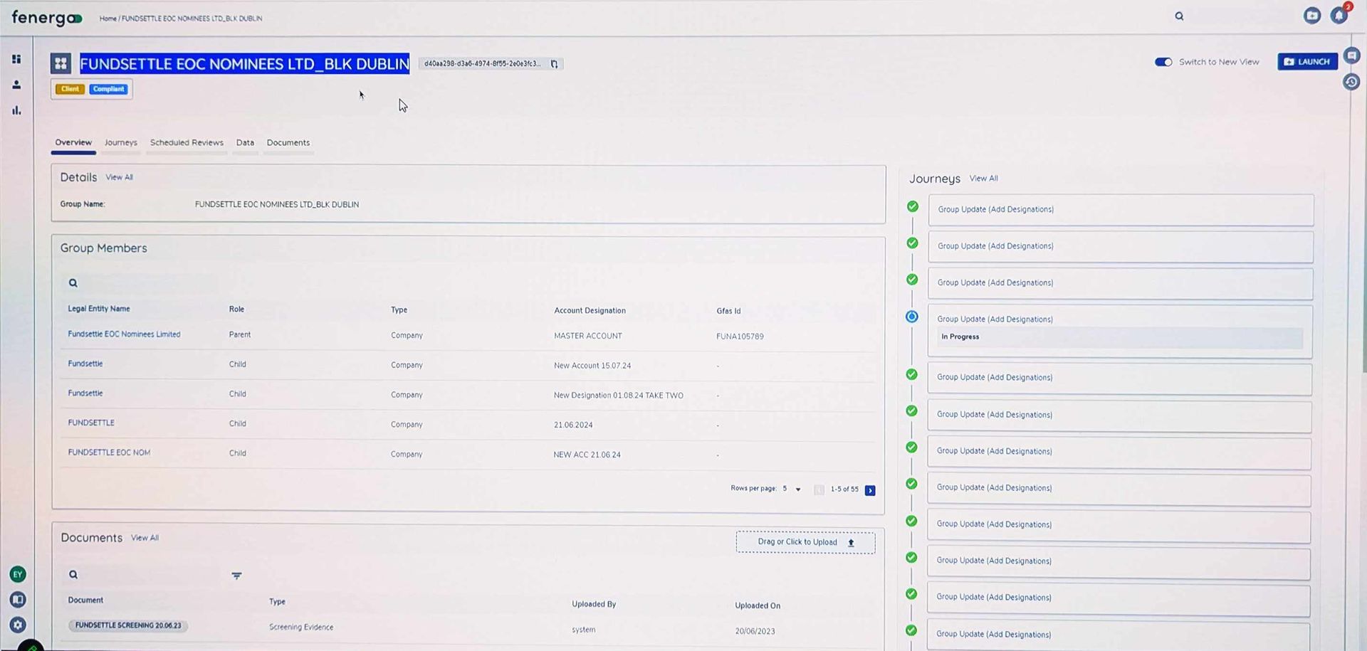
Assigning metadata at the point of upload is good. Users are motivated and have the best chance of remembering conversations with the client.
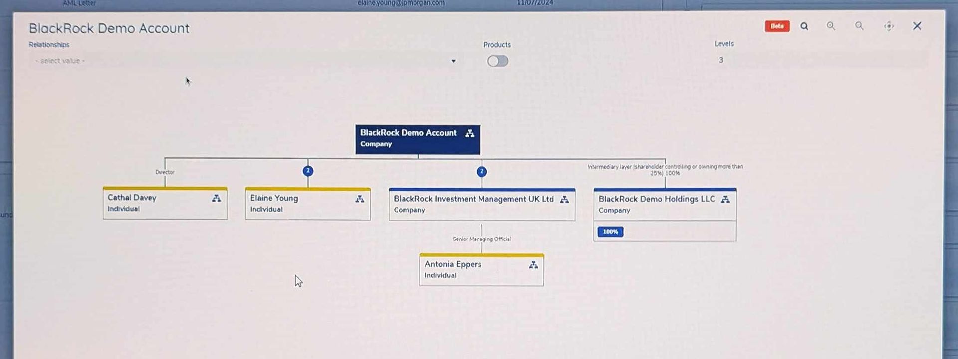
Trees are easily understood, and this one has a nice feature to create hierarchy (the level drop-down.) But this example lacks a freehand section that could be necessary if the client has a complex business structure.
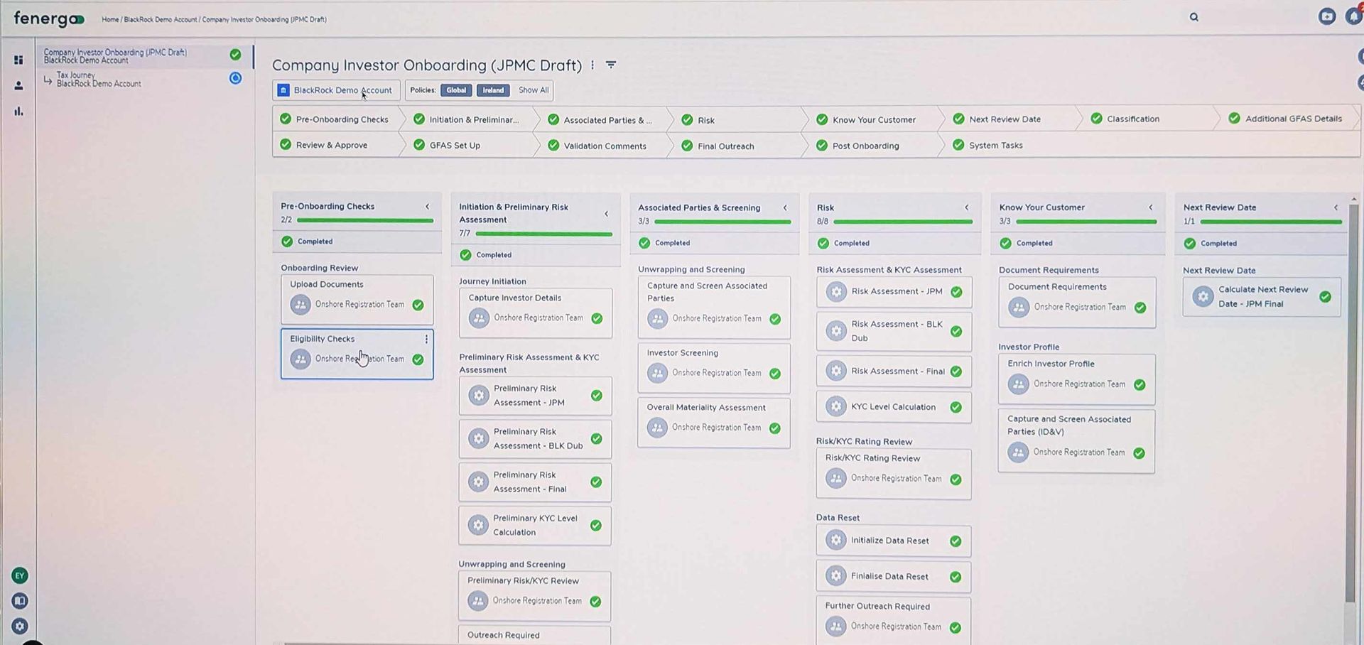
Journey detail: granularity is great for Operations, but less so for Advisors who mostly want to know "how long until it's finished". Permissions-based display is the answer.
The Overview shows about the right amount of content, but it lacks a clear way for the viewer to accelerate the case.
Competitor and predecessor review
Fenergo is third party onboarding and KYC solution. I assessed its features and journey and found much to like:
- Highly visual experience: progress meters, tree hierarchies and colour coding abound, in contrast to the austere aesthetic of the existing system.
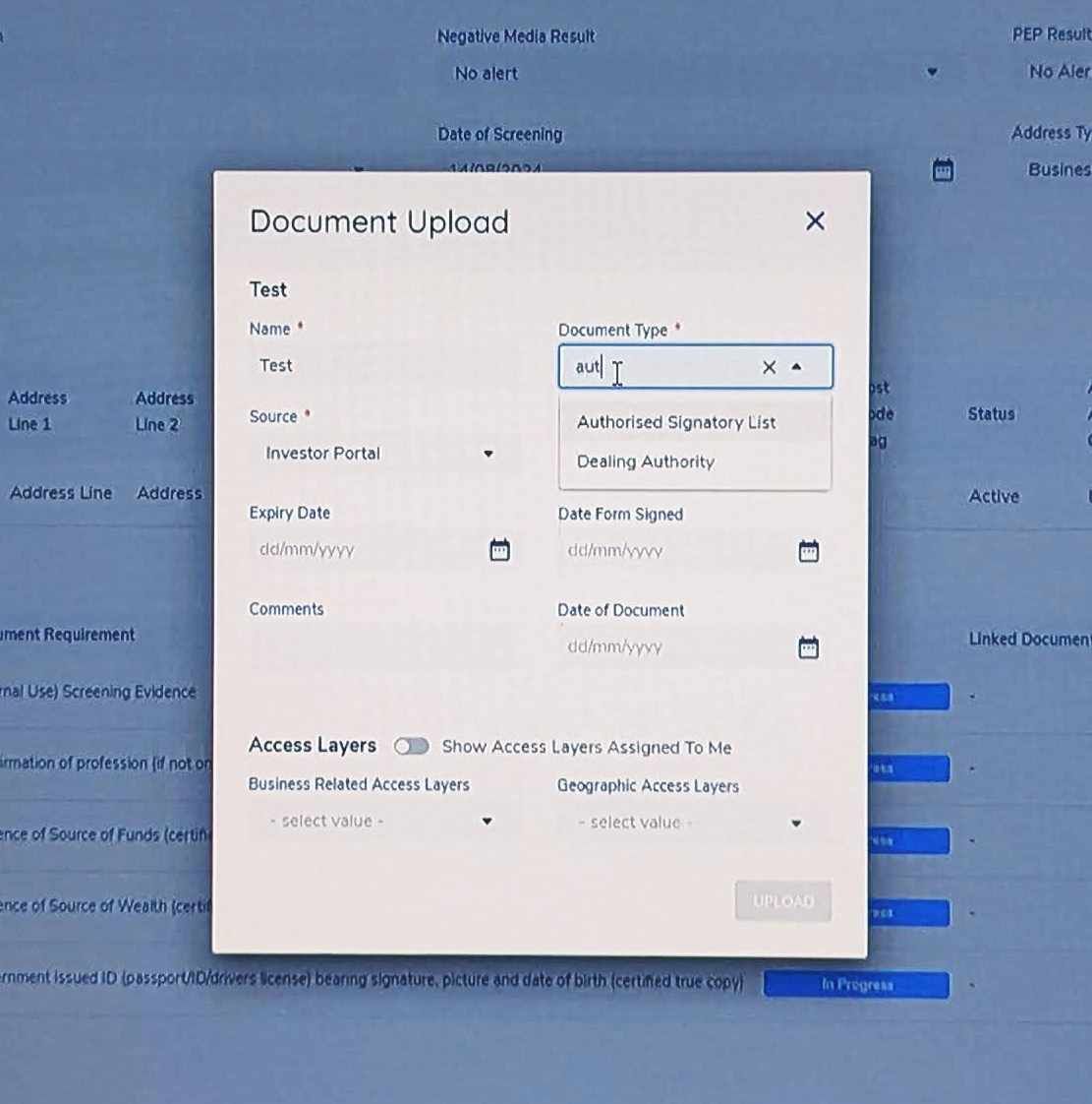
- Assigning document properties at the point of upload prevents duplication and access permission problems later.
- Architecture: 52 tasks were split into 14 categories. I felt that 14 top level categories was too many for a user to easily absorb, so I made a note to test it later.
The existing COB (Client OnBoarding) system was generally poor, but had some interesting takeaways:
- By virtue or being built over many years by many teams, there were some accidental gaps and overlaps which created "power user" features. We noted that these abilities should be carried through to the new design.
- The sprawling design meant that training new users was lengthy and frustrating. We determined that intelligibility should be a metric we tested our new design upon.
AI vibe coding/generative designs
I used Figma Make and Lovable outside the firewall to discover any blind spots, and to generate new ideas.
An AI generated specification was used to protect IP, and after a few iterations both Figma Make and Lovable made a reasonable generic design.
Their designs raised some interesting questions:
- What is the best way to express risk level?
- How deep vs. wide a navigation is optimal for our audiences?
- Given that first-time failure is is more common than success, should our "happy path" be ready to accomodate frequent setbacks?
Neither app was able to handle complex branching logic or subtle variations in language such as may/could/should/must, that we collaborated with our KYC SME to develop.
Lovable
Lovable did well with augmenting its dashboard with graphical representations, and seemed to appreciate the scale of the app better with a deeper navigation scheme and management areas.
Figma Make
Figma Make did well by using intuitive categorisation of data types, but failed to apply a navigation scheme that could allow anything beyond "happy path" journeys for simple clients.
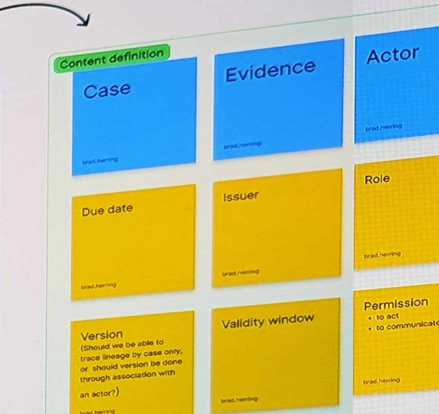
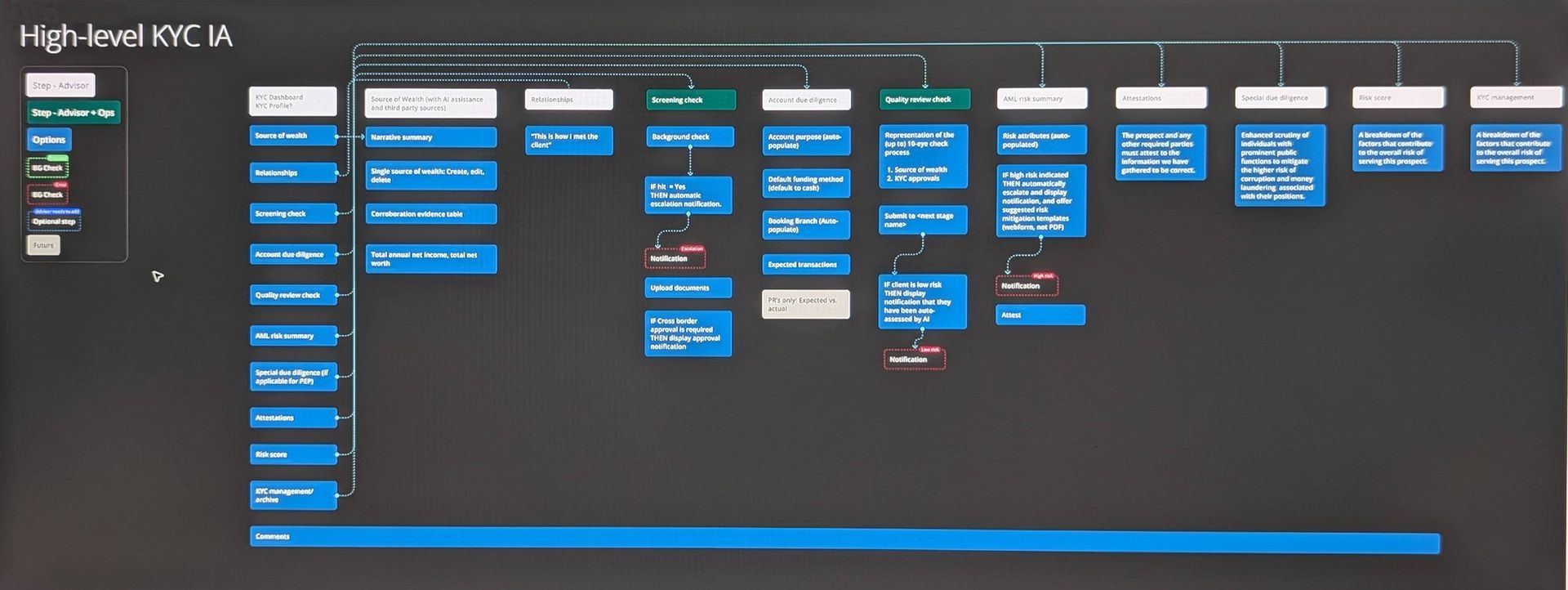
Architecture through Object Oriented UX (OOUX)
Years of un-coordinated growth created a Frankenstein's monster of bolted-together apps and architecture that made the lives of staff and clients painful.
I led an exercise to create an Object Oriented UX architecture: a collection of objects, actions on objects, and relationships between objects that I validated and iterated with SME's.
This radically simplified data structures and paved the way to slim down the amount of UI required. The greatest achievement was the sigh of relief when staff looked at it and said "this makes sense".
A detailed view can be seen here.
Service Design
My team and I worked as the connective layer between the U.S. and International lines of business, which operated on disparate technology stacks, workflows, and expectations.
The role required unifying processes across these environments while shifting responsibility from Operations teams to Advisors (many of whom saw the work as outside their remit).
The project demanded not only technical coordination but careful navigation of organisational politics to secure buy-in and deliver a sustainable, shared way of working.
View a high resolution version of the Onboarding Service Blueprint.
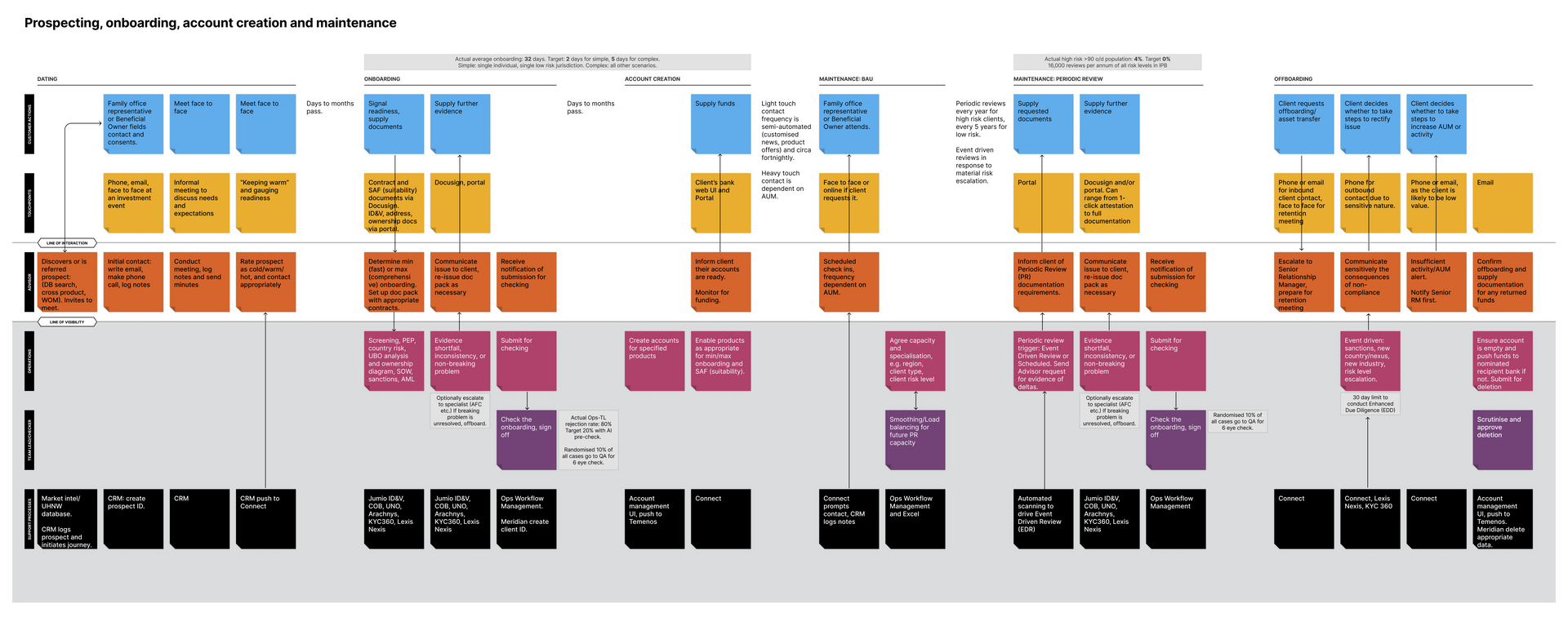
Service Blueprint full lifecycle
This view includes the full lifecycle, including maintenace and offboarding which is usually ignored in favour of bgetting customers through the door.
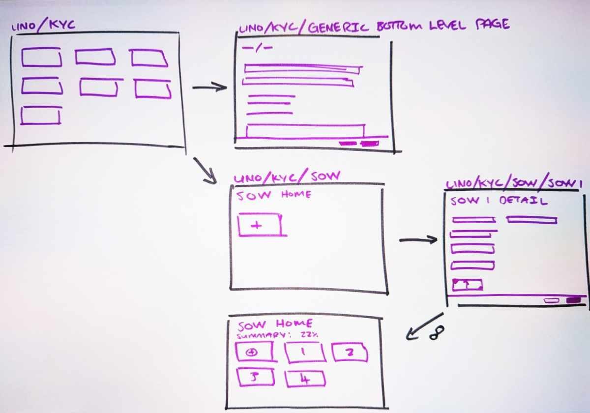
Sketching
Still the king of rapid iteration!
Mapping the experience
Seven designers co-ordinated about the way that users would move between their domains. A site map ensured we knew the pathways between every feature.
Hybrid components
Advisors needed to know the relative spans of each asset. I collaborated with our KYC SME to design a hybrid module, and then push it through the design system council's approval process.
Navigation
We had agreed upon a design language that avoided concertinas, however my assigned section was the only one that needed three levels of hierachy. We went through many experiments with ungainly triple level navigation, popovers and show/hide interactions to finally settle on a heavyweight popover.
Summary page
The type and volume of information on the summary page went through many iterations. We knew that expert users (Ops) were our main audience, but infrequent users (Advisors) needed quick updates.
Interaction design
I always start with sketching to shake out issues quickly and maximise creative freedom.
Progressing to digital, I've found that mid-fi doesn't save much time given how easy design systems are to use. Client expectations are also now more mature: they know that a crisp looking static design doesn't mean it's ready to deploy.
In this project, seven designers needed to create novel patterns quickly, which caused duplication across common components. We solved this by:
- Discovering who needed a new component most urgently and assigning the work to them.
- Agreeing as a group what functionality each component needed to have.
- Creating a new design system to pull from.
Evaluative research
Interactive prototypes and written propositions were put before user testing subjects to gather feedback.
As onboarding is a multi-step, multi-role process, we weren't able to gather any end to end metrics. We did experiment with other metrics:
- satisfaction scores out of five required more samples to be meaningful than the circa 8 we took at each round of testing.
- Net Promoter Score (NPS) was suggested to be able to compare with industry averages, but didn't get traction with senior leaders.
A point of failure was communication between the product team, design triad (experience design, content and research) and users: sometimes features and propositions were tested that were outdated, irrelevant or known to be unwanted.
-
![]()
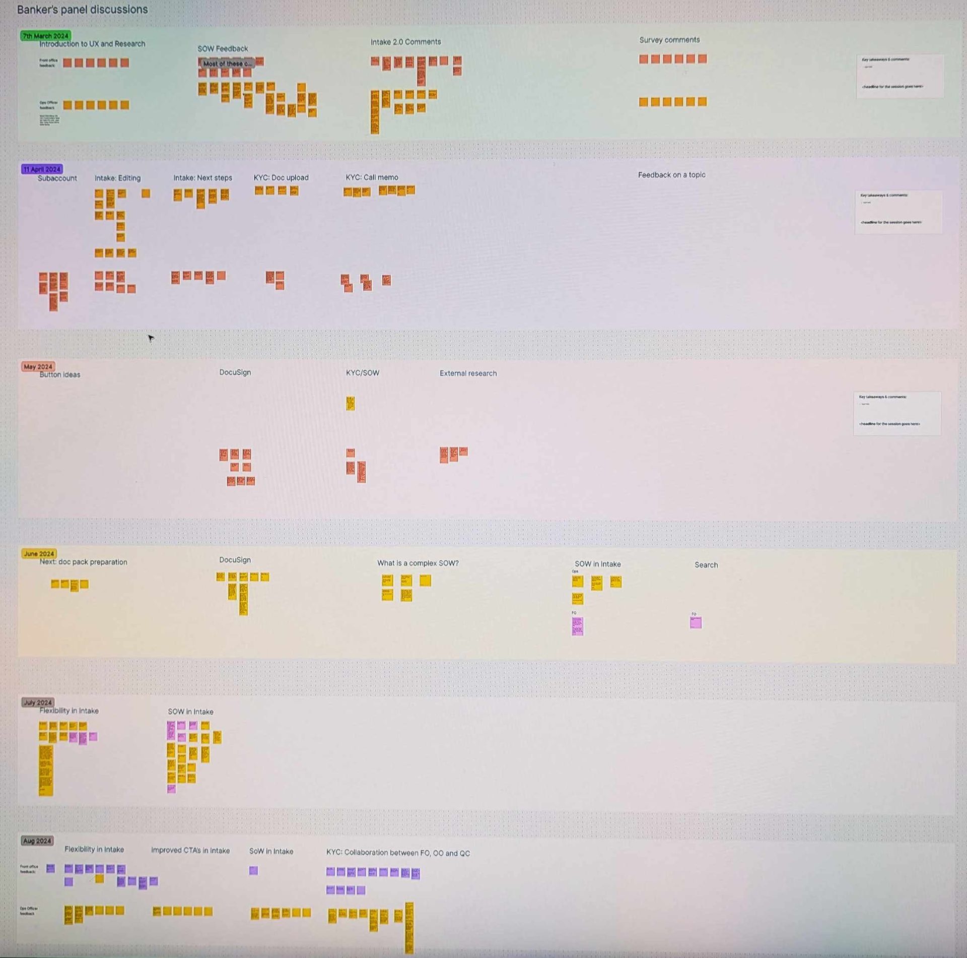
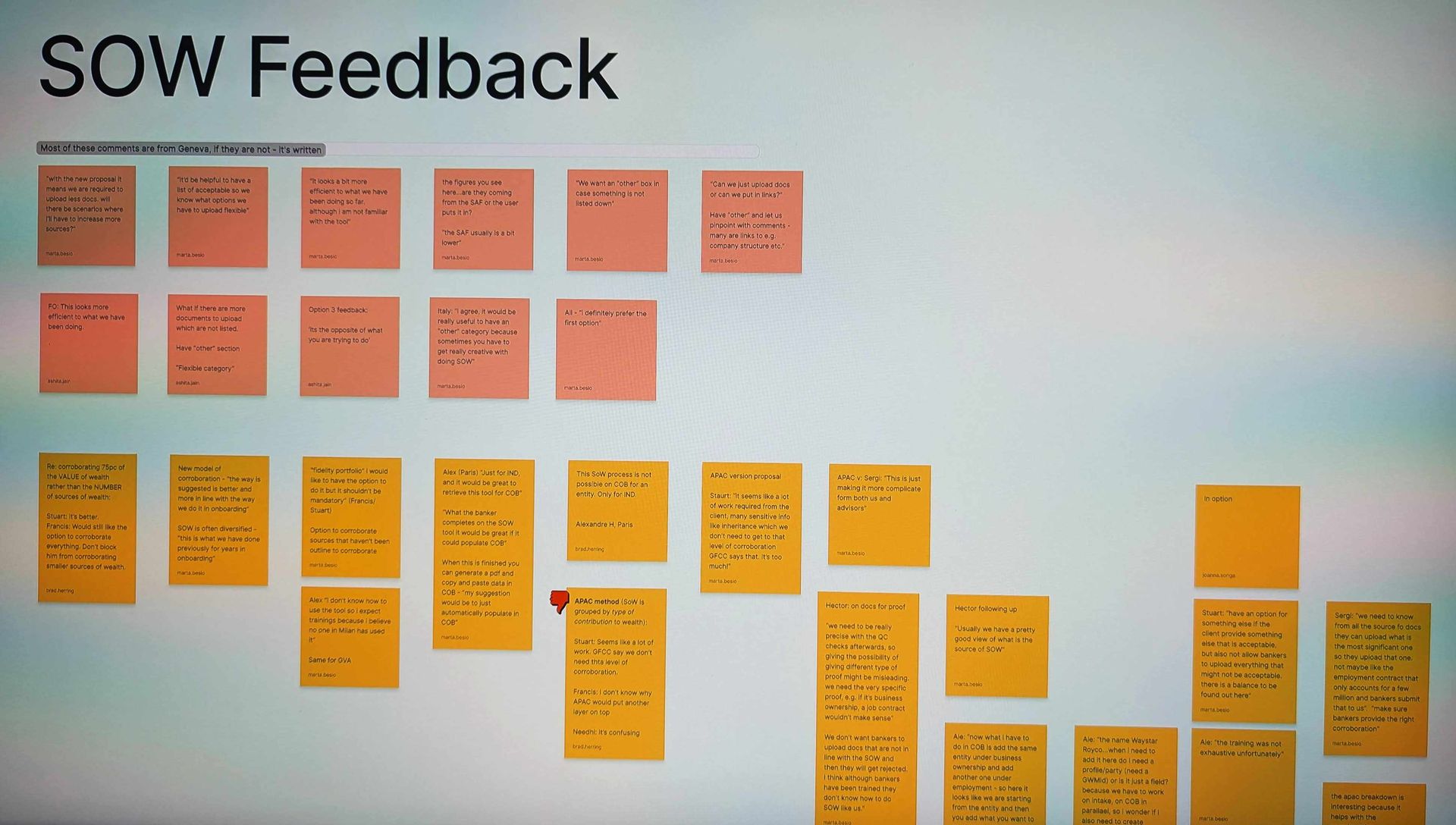
Identifying long term trends
ButtonA year's worth of panel discussions were kept in a single Figjam board to aid comparison and identify trends.
-
![]()
User testing feedback
ButtonFeedback was taken by a scribe while the facilitator ran the test.
-
![]()
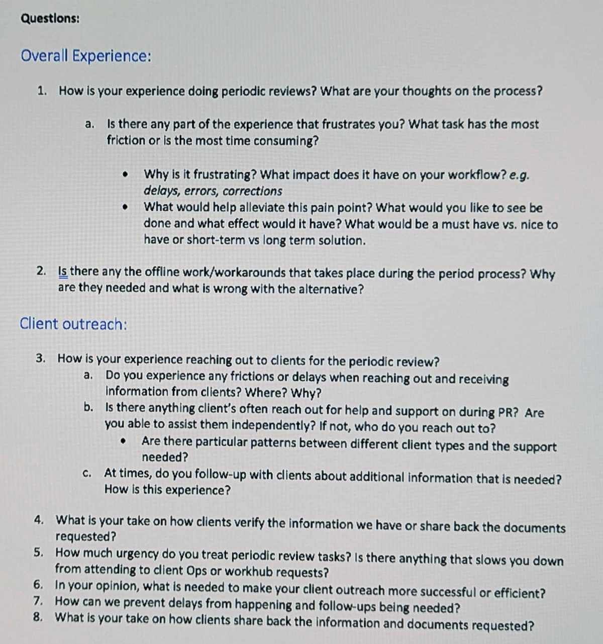
Discussion guide
ButtonThe guide contained the main data points we needed to validate our hypothesis, but the facilitator was always able to go off script if they felt it was necessary.
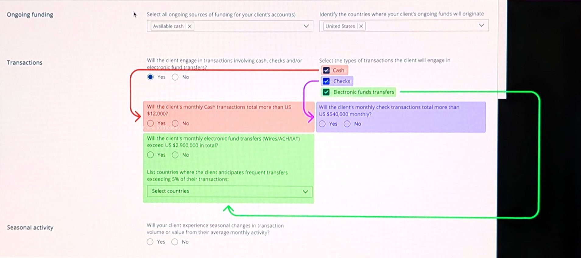
Visual explanations
Visuals are always the best way to explain how parts of the UI show and hide in response to user interaction.
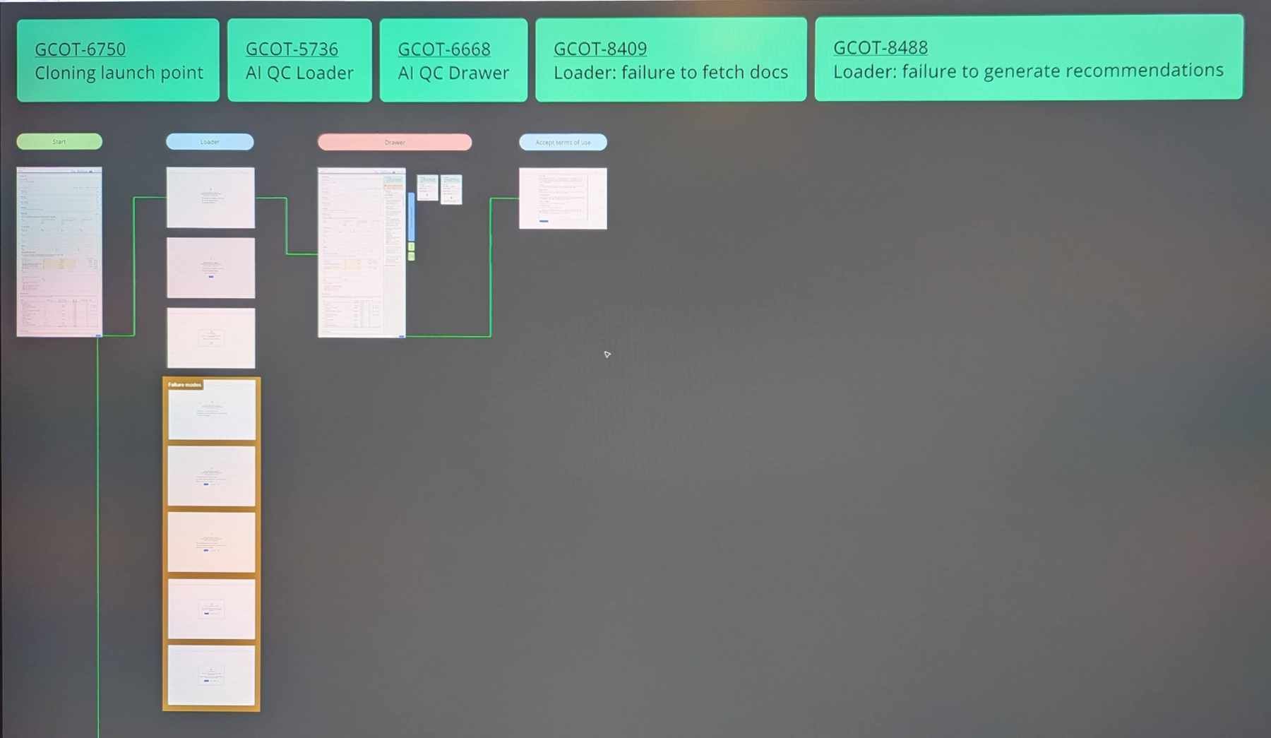
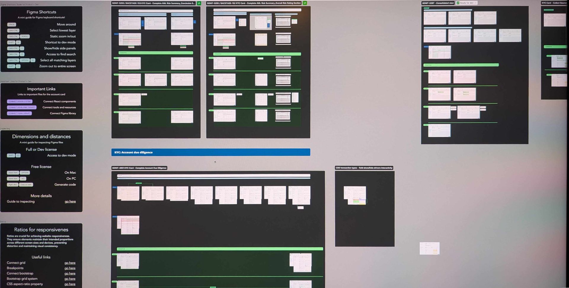
Figma linked to JIRA
All work in Figma is linked to JIRA for traceability and to ensure UX doesn't do any unbudgeted/unplanned work.
Greenlines overview
An explanation of what Greenlines are for non-technical audiences, and instructions for using Figma for developers
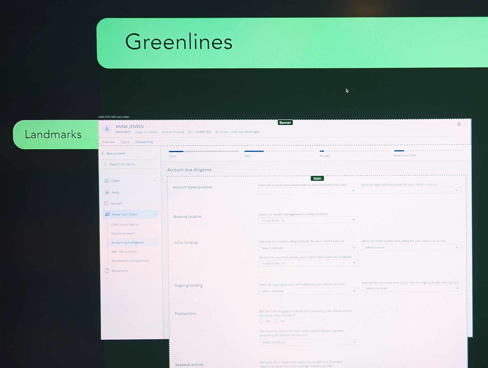
Greenlines: landmarks
Button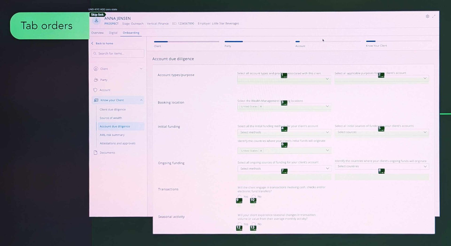
Greenlines: tab order
Button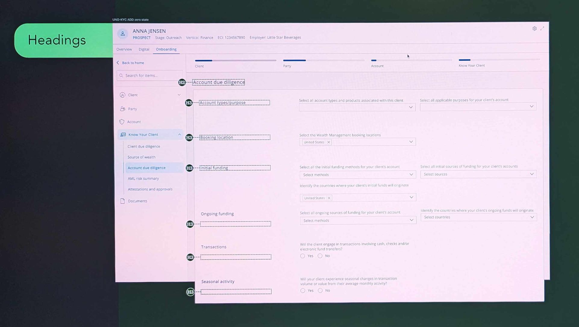
Greenlines: headings
Button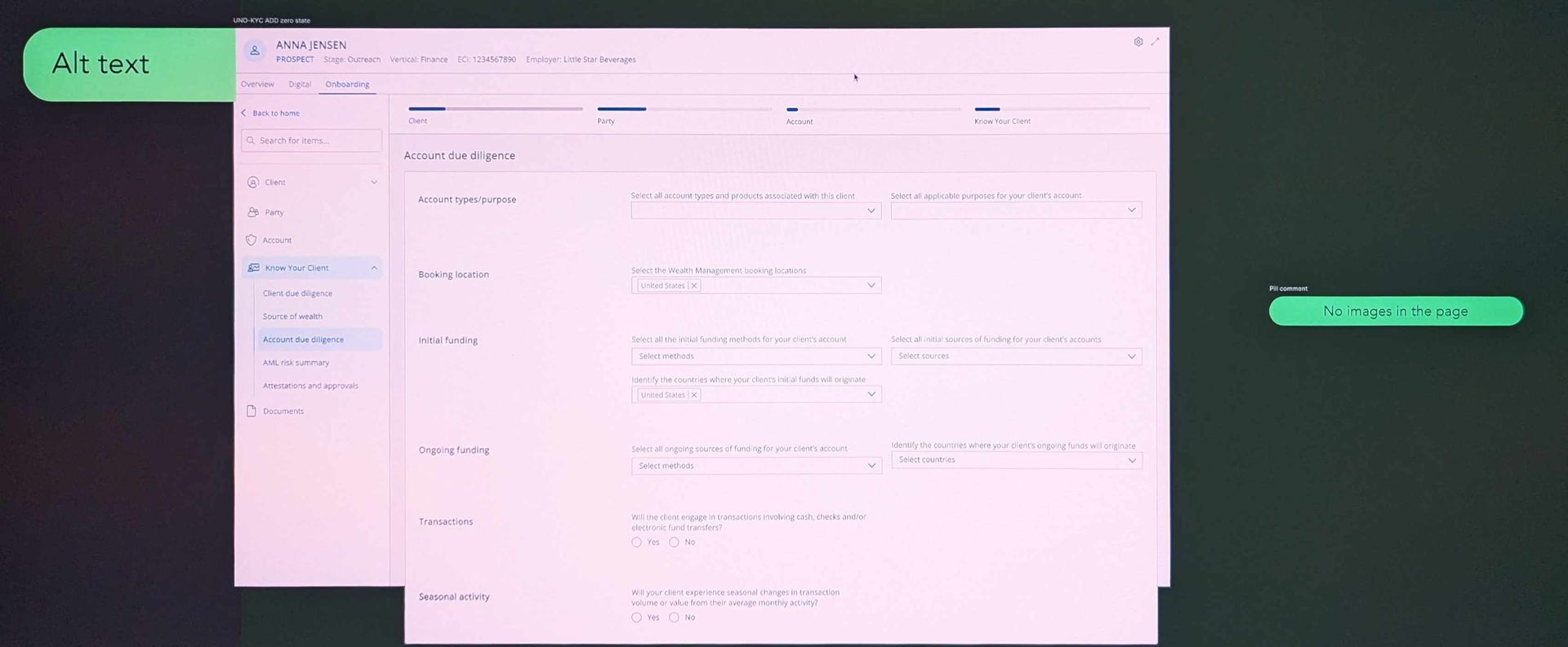
Greenlines: alt text
ButtonDeveloper handoff and accessibility
We developed the new design over dozens of sprints; we were cooperating closely with developers in daily stand-ups.
When a specification document's explanation of conditional logic was too complex , I made visuals to aid understanding.
All Figma work was associated with a JIRA ticket. This additional overhead ultimately saved UX time by ensuring all work was budgeted and recognised.
I specified Greenlines for accessibility:
- Landmarks
- Headings
- Alt text
- Tab order