Deutsche Bank: Customer Lifecycle Management
Design Ops
Qualitative and quantitative research
Automated metrics
Mapping the experience
Architecture through OOUX
Testing with lo-fi and interactive prototypes
I led a global research program with a team of 4 UX designers to deliver an unprecedented understanding of a global workforce which enabled:
-Fifteen million dollars in savings
-592 FTE headcount reduction
-Vastly reduced workload for 6000 employees
Failure to screen clients properly and regularly had led to £163 million in fines. The regulator required the bank's customer screening backlog to be cleared; unachieveable with ways of working at the time.
Our brief was to understand why the performace of globally distributed teams was different, and standardise on an optimal way of working.
Design Ops
My team of four needed to discover a large landscape of apps, feed dependent processes, satisfy regulatory scrutiny, and keep senior stakeholders abreast of progress.
I produced:
- a project plan
- weekly reporting
- a RACI matrix
Resourcing was especially challenging as the size of team was changing due to attrition and graduates rotating.
Qualitative and quantitative research
PHASE ZERO
We conducted 6 senior stakeholder interviews to verify the goals.
Then created hypotheses such as:
We believe that CLM Operations staff are not using their tools properly.
We will observe participants workflow (contextual inquiry).
And we will know we are right when we observe more than 25% of particpants using (a legacy system).
PHASE ONE
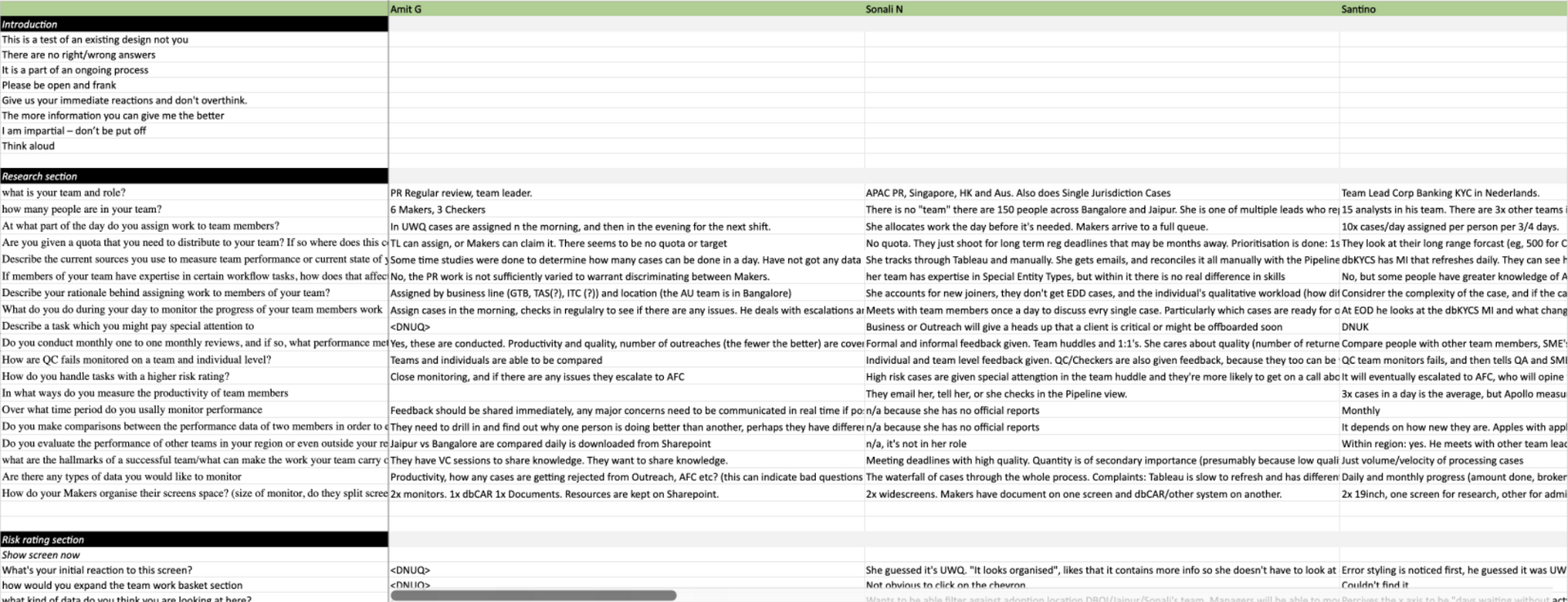
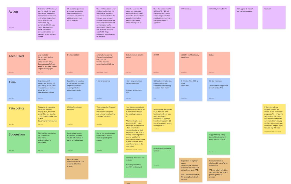
29 user interviews covering all regions and roles:
- Maker, Checker, Outreach.
- USA, APAC, Lux, India, Vendors.
We identified 9 themes through affinity mapping.
PHASE TWO
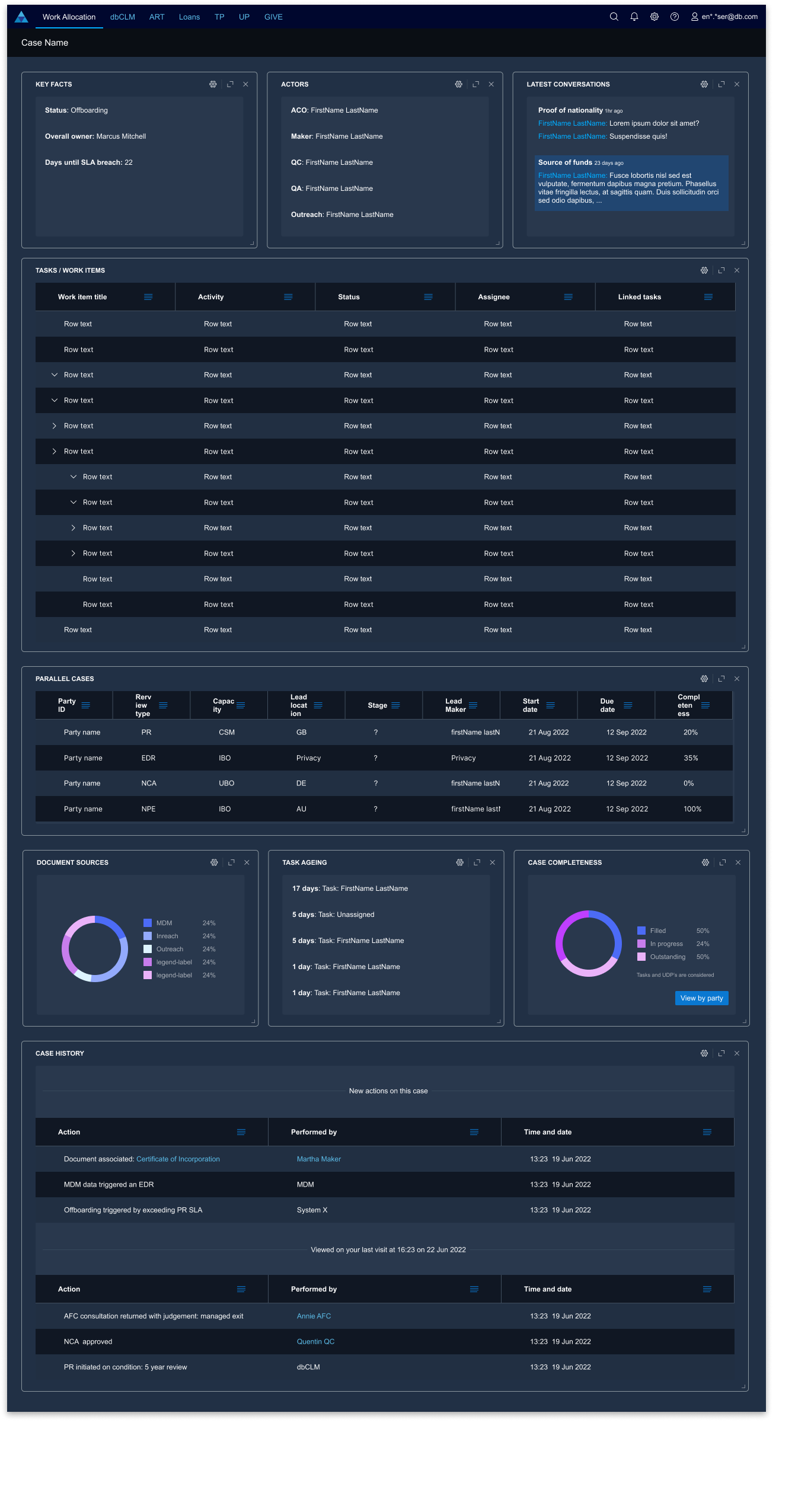
We prioritised three themes:
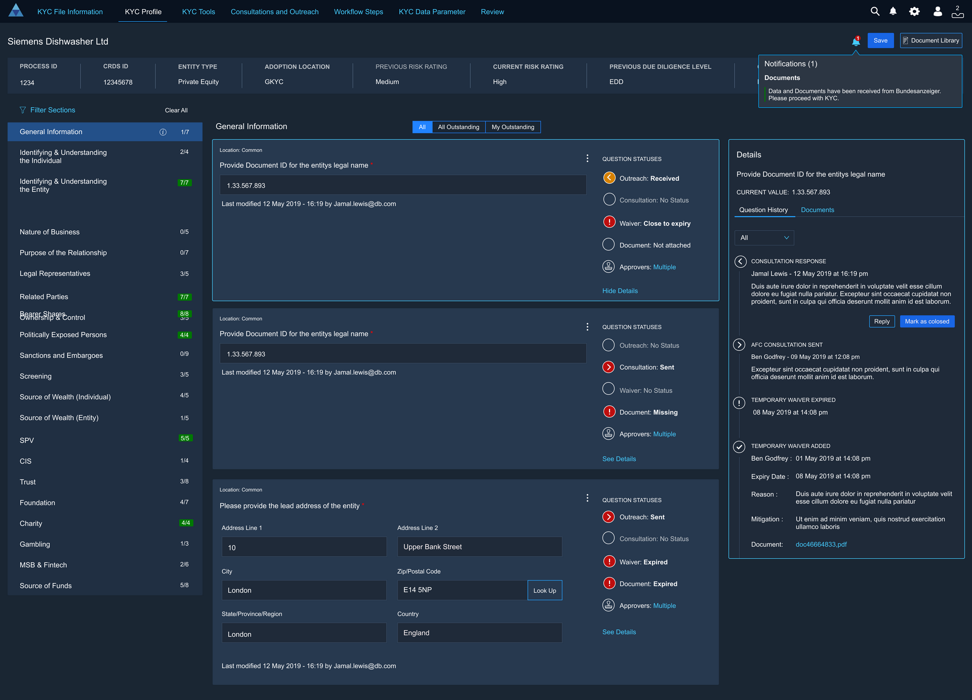
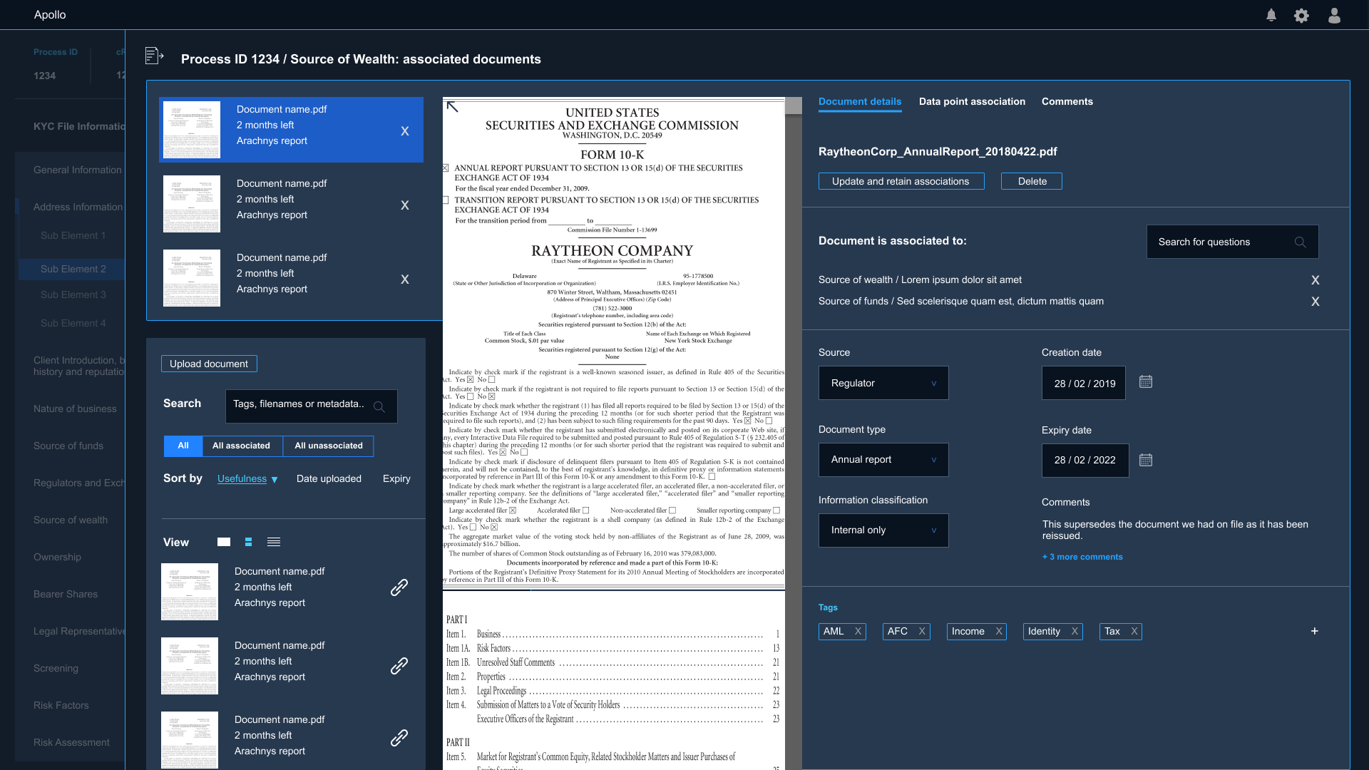
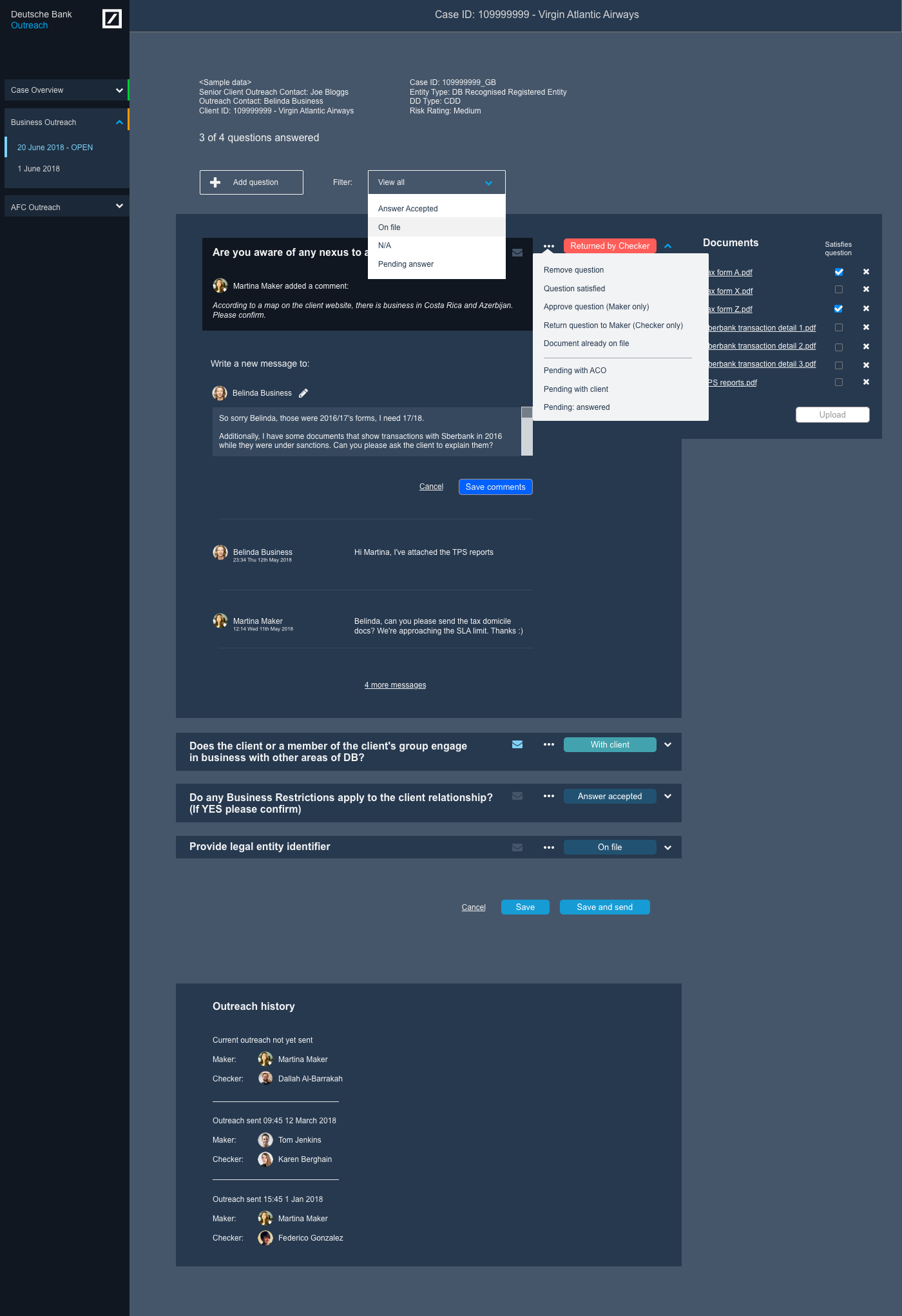
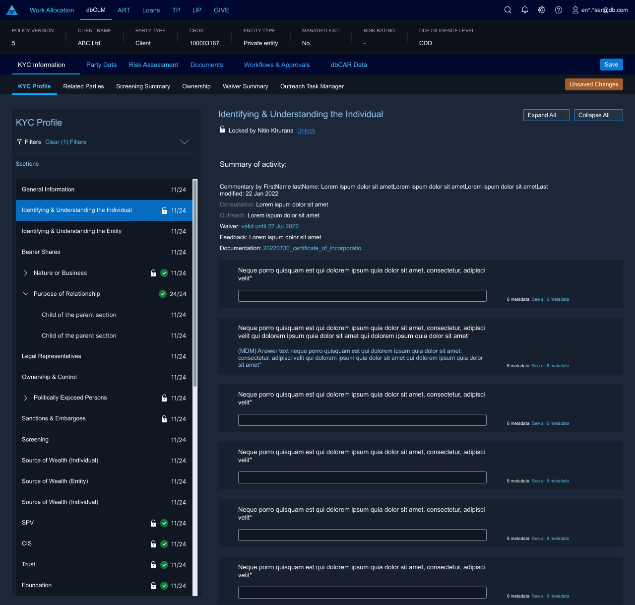
- Case visibility
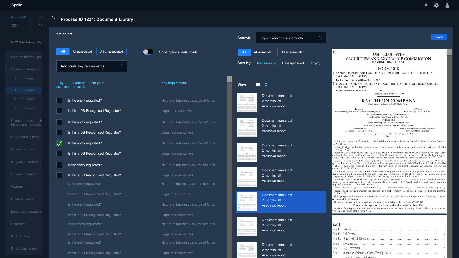
- Document Library/Workflow
- Related Parties
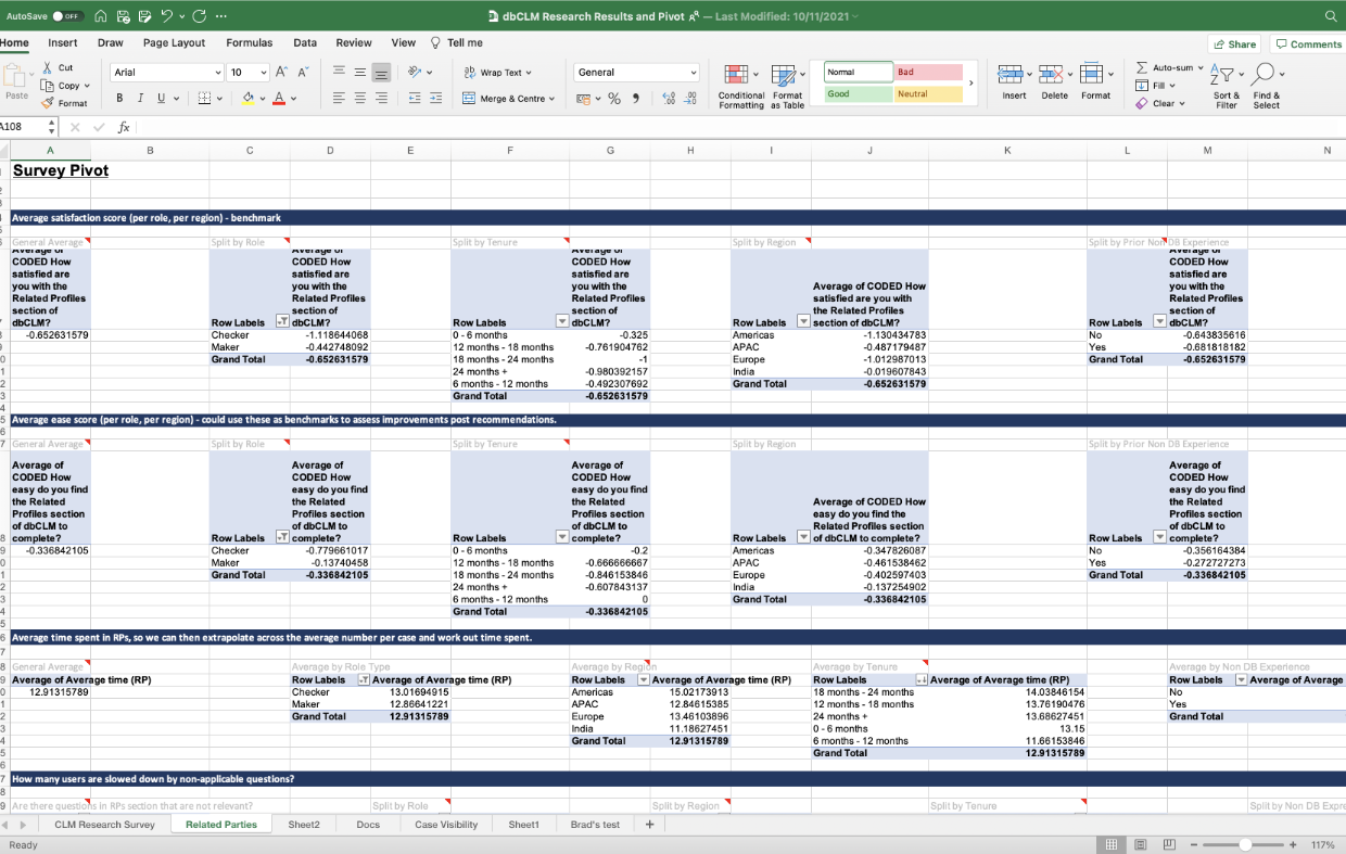
To validate the qualitative findings, we conducted a survey which received 264 responses globally from a user population of 6000.
We used pivot tables to gain different perspectives, such as:
- The longer a user had been working in CLM, the less satisfied they were with a particular section of the system: experience didn't allow them to overcome difficulties.
- Workers in the USA used more manual processes than those in India.
- Indian responses tended to be more positive and agreeable. We recommended further research to determine whether this was due to cultural, training or process factors.
"..your data are fantastic"
VP, User Engagement Programme
"..the content is explosive"
Director, Global Head of KYC Change
Automated metrics
I worked with analysts to establish what metrics were available, then determined which should be used as benchmarks. We combined two results from two analytics packages so we could measure
- Micro, in-page interactions such as time to click
- Macro, whole-of-process interactions such as dwell time, loops and total time to process.
Between the research and the metrics, we uncovered severe problems. Nobody had ever got such a clear view of the waste that was occurring.
"Whilst it does not necessarily make comfortable reading, it is incredibly useful in helping us to create a platform which is trusted, useful, accurate and efficient"
CIO of Regulatory Technology for the Corporate & Investment Bank
Mapping the experience
Workshop participants were available in London to do face-to-face process mapping exercises. To get an international perspective, we validated the output with other teams globally in remote workshops using Miro and Figjam.
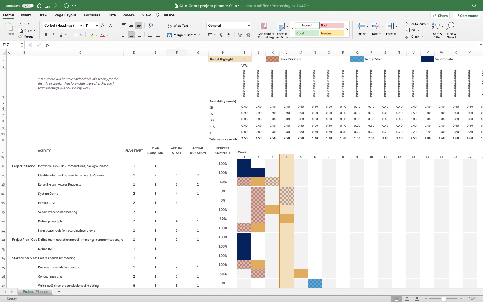
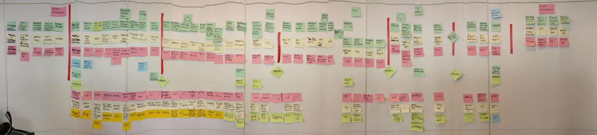
A Gantt and swimlanes hybrid diagram was used to discover duplication and overengineering, such as 14-eye checks.
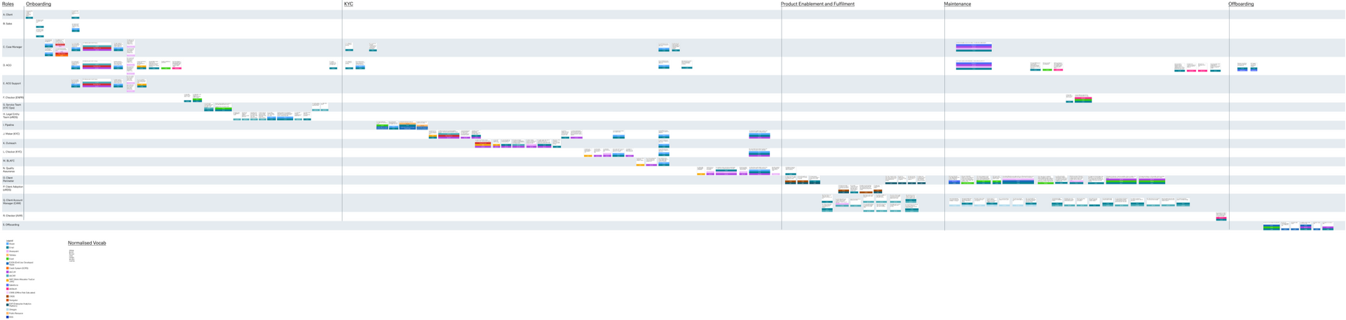
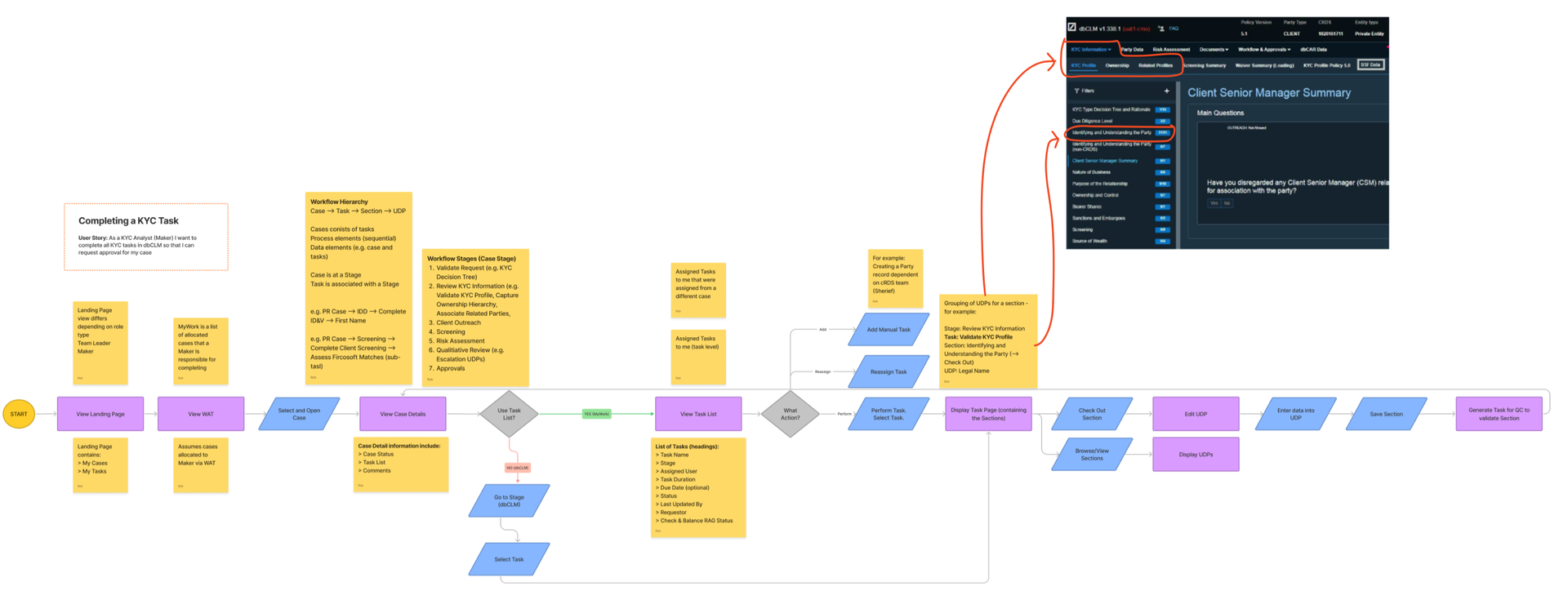
A flow diagram was needed to map the current and optimal future state, because developers needed the detail and stakeholders needed to know our solution was workable.
"..you did an awesome job yesterday and I'm really pleased with the output.
I will be requesting your services a lot more going forward."
Director, Divisional Control Office
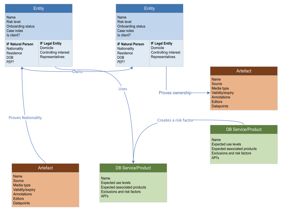
Architecture through OOUX
To untangle the mass of systems, duplicate names and acronyms I employed the Object Oriented UX method. This takes a content-first approach and seeks to distill the problem space into its most basic form:
- Objects
- Data
- Relationships
This technique allowed me to cut through the confusion and see that we didn't need twelve unique task management UI's, just one.
A single core work item UI design could serve all of CLM and specialist use cases could extend it.
Testing with lo-fi and interactive prototypes
We had excellent access to users:
- To sample a wide population we were able to request user profiles (role and region) from a pool of 6000 across the company.
- For quick validation of design ideas, we contacted users within a pilot group directly.
Interactive prototypes were made in Figma which provided excellent visual results but lacked the interactive options afforded by other tools such as Axure.
Remote sessions were held through screensharing and we scaled our testing up with centralised scripts and frequent team debriefs.